

Ujiyara
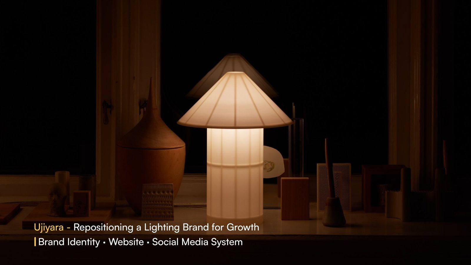
Repositioning a lighting brand for growth
Ujiyara comes from the Hindi word उजियारा, meaning light. The brand stands for warmth, creativity and modern home décor.
Ujiyara had good products, but the brand behind them lacked clarity. We rebuilt it from the logo up so it feels warm and premium everywhere a customer meets it: on the website, in their feed, and in the box.
- Industry
- Home décor / Lighting
- Website
- ujiyara.in ↗
- Scope
- Brand identity rebrand
- Website experience design
- Social media strategy
- Platform
- Divi → Shopify
Good products, unclear brand.
- Generic visual identity
- No emotional connection with light
- Inconsistent digital presence
- Low brand recall
From product-led to premium.
Turn Ujiyara from a product-led brand into a clear, warm and premium lighting identity that performs across design, content and ads.
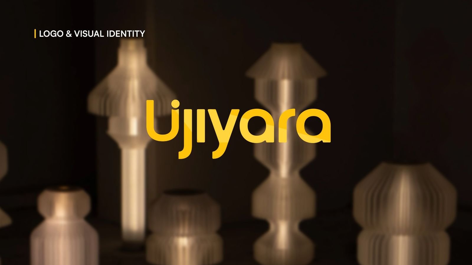
Logo & visual identity
A busy, mixed-script mark became a simple, modern wordmark that stays clear at any size, from a product tag to a billboard.

Website experience
We moved the store from Divi to Shopify and redesigned it for clarity and focus, so the products do the talking and browsing feels calm and premium.
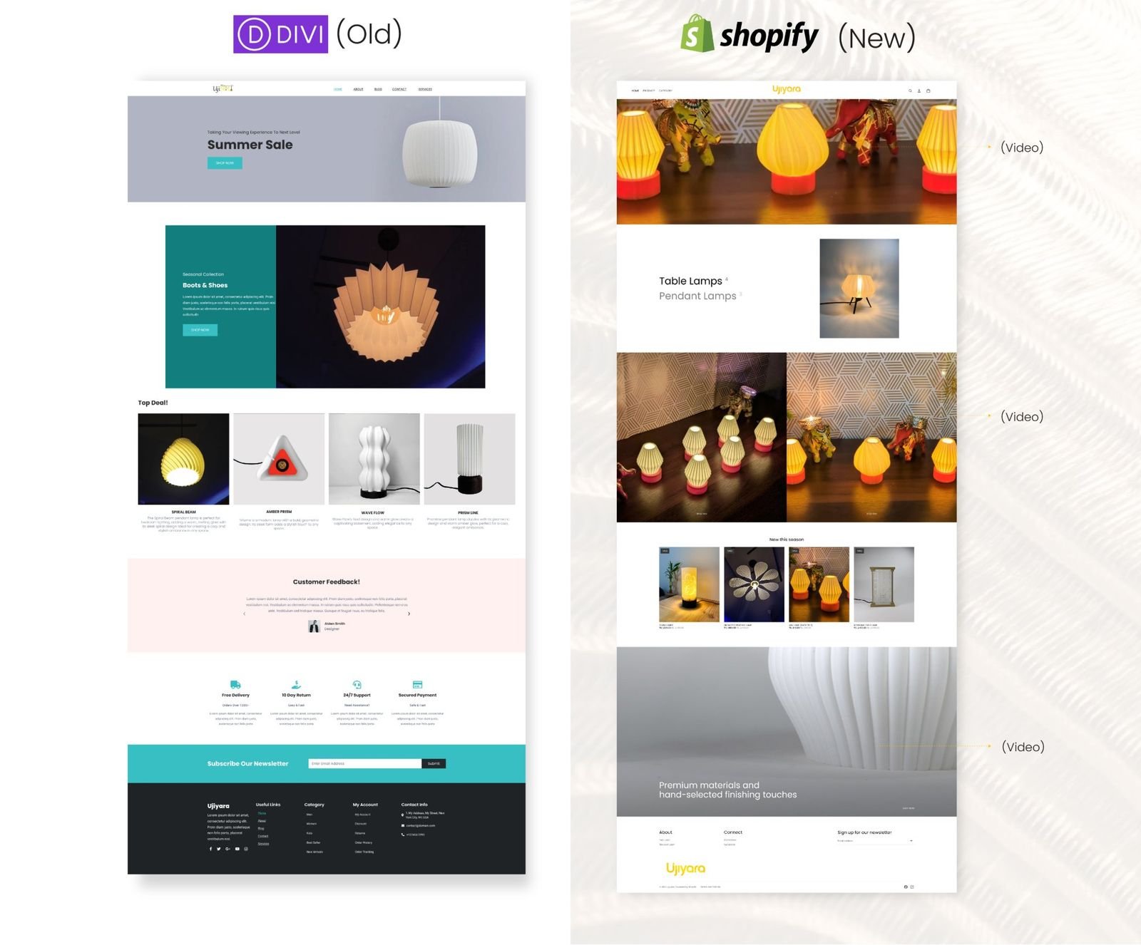
- Simpler layout with a clean, modern look
- Bigger product visuals with warm aesthetics
- Clearer navigation and hierarchy
- Less visual noise, more focus
- One consistent brand language
- Faster sections on mobile and desktop
Social media system
Structured layouts and a consistent visual style across posts and ads. Audience-focused storytelling and a disciplined posting rhythm turned quiet scrolls into real reach.
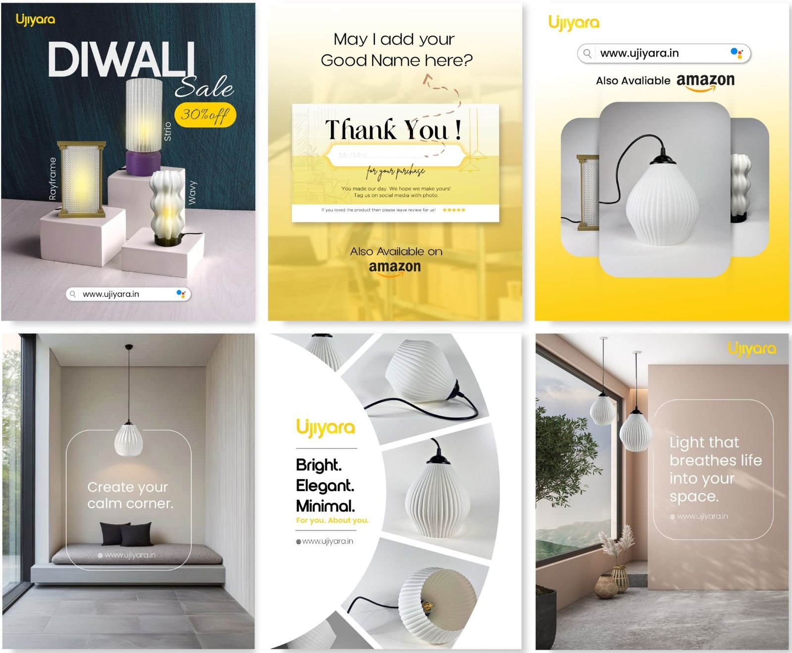
Light is more than a product. It shapes emotion, space and experience.
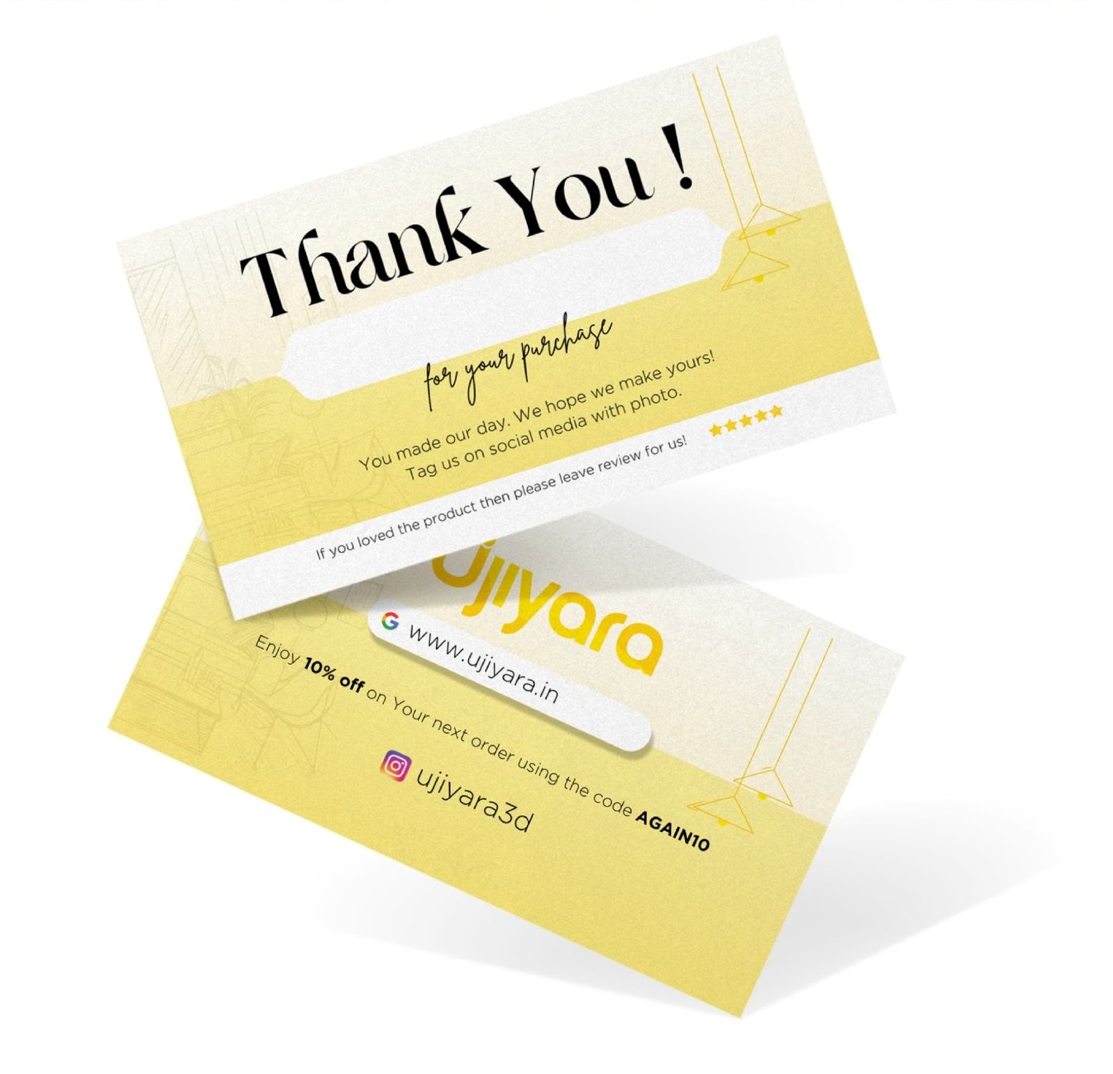
The care continues after checkout. A branded thank-you card asks for a review, invites customers to tag Ujiyara on social, and offers a repeat-order code, turning every delivery into the next sale.
40K+ organic views, a 40% increase in sales, and better website conversions, driven by one brand system across identity, website and social.